IBM - Interconnectivity
Like many large enterprise software companies, products and services go through a series of evolutions. Some phases change often, some remain the same for a little bit too long. In the case of the Interconnectivity and Hybrid Networking suite of services, the latter was true when I joined. As a brand new design system was being released, we had the opportunity not only to refresh the design but also to rethink the current user experience as a whole. Out with the old, in with the new new.
MY ROLE
Team Lead
User Experience
User Interface
Product Strategy
THE CHALLENGE
The Interconnectivity suite of services is a complicated one. The intricate combination of manual physical setup and virtual processes made automation virtually impossible without a complete overhaul of the system itself. Not an easy proposition to make as a brand new member at IBM. Because you know what they say, "time is money."
THE APPROACH
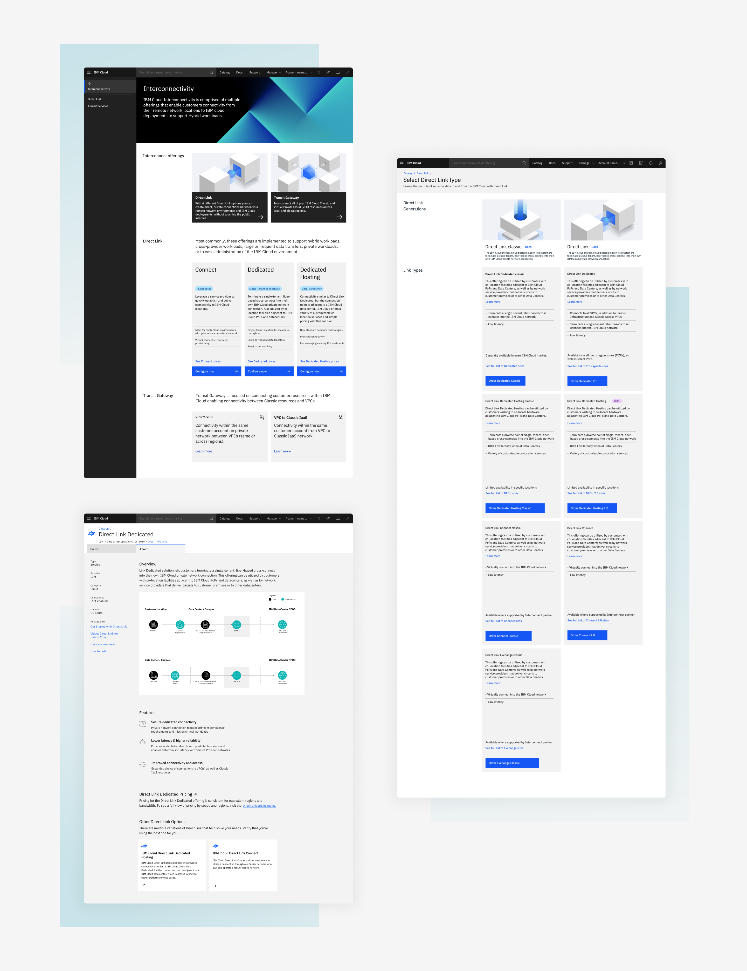
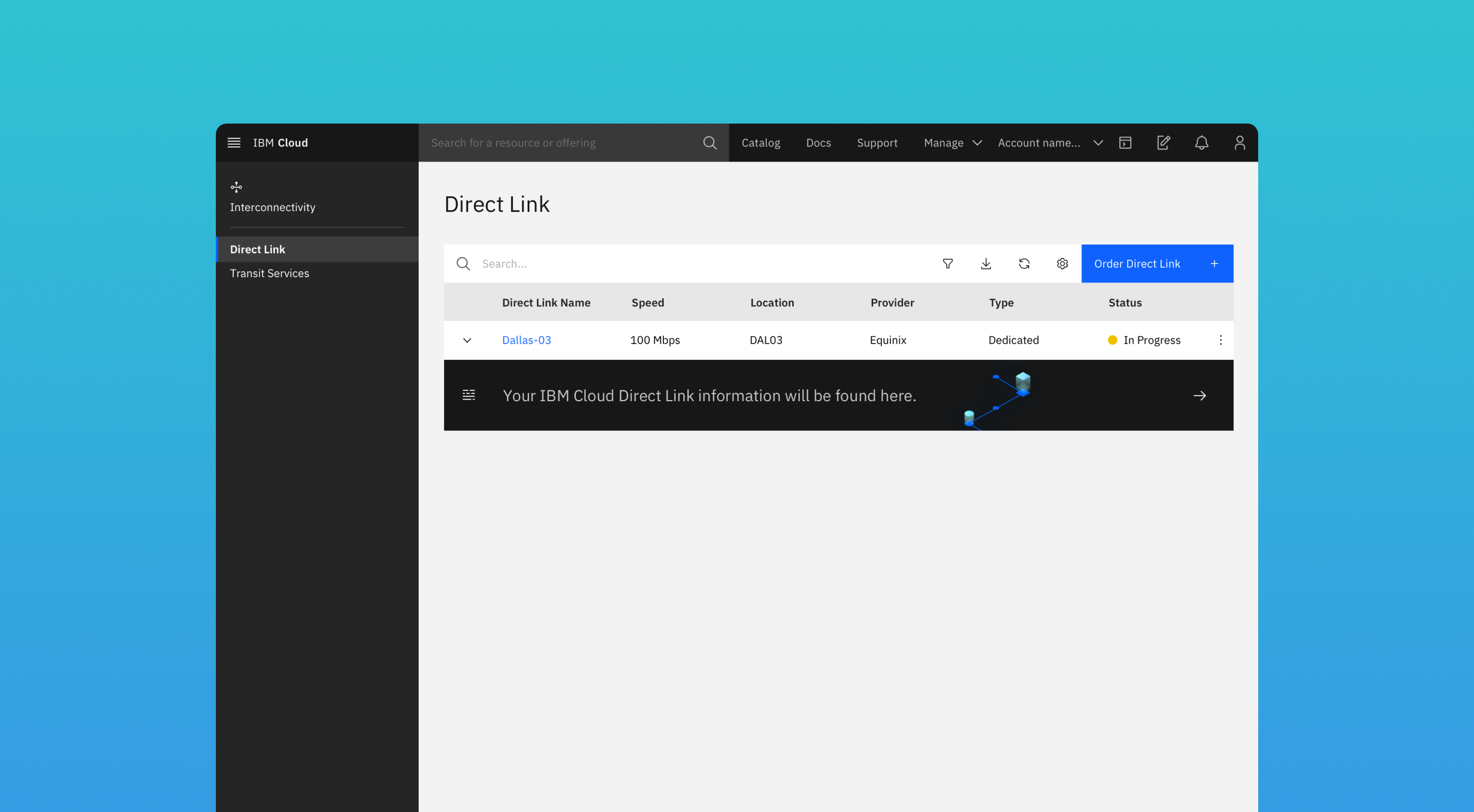
While completely changing how a user can 'provision' this service wasn't entirely on the table, there was plenty of room to rethink how the user perceives their experience. Some actions were updated to provide better feedback and set clear expectations, while others helped to simulate a more seamless user experience without the expensive makeover in the backend.
3
TEAM OF DESIGNERS
2.5
YEARS TO ACCOMPLISH
4
SERVICES IN THE SUITE
THE ASSESSMENT
Fresh start, fresh eyes
The benefit of being brand new to an organization is being able to see things without bias and you could say that when I was immediately tasked with overhauling the Interconnectivity suite, I had no idea what I was doing.
My first step was just to learn as much as I could from the previous design team, the SMEs and some trusted users, through some deep-dive workshops and brainstorming sessions. I gathered the information about the existing user experiences, the pain points, and the unmet desires from the users and our teams and began to identify the holes. Based on the findings, I presented back my team's theories on how these issues may be addressed back to the offering managers and development team to make sure we were in alignment.

THE EXPERIENCE
Clear expectations. Full carts. Can't lose.
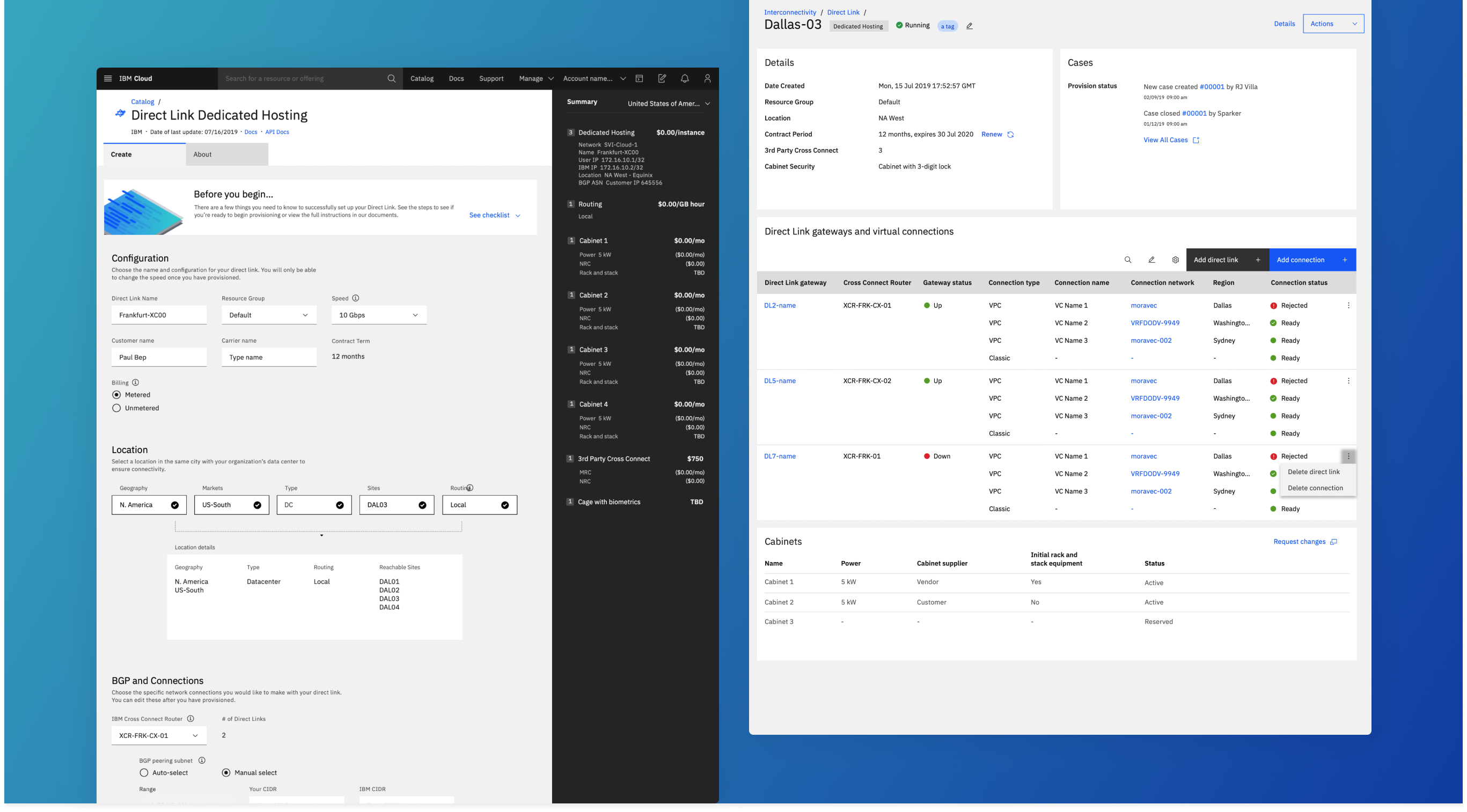
The primary issue we found in the existing product was that it left much to the imagination for the user and set zero expectations for what is happening or should happen next. For example, the Direct Link service is a physical connection from a user's on-premise resources to data centers that provide secure connectivity to their cloud resources. Because of the substantial amount of effort it takes to set this up, it is a costly service that cannot be easily undone with the click of a button. Users were required to set up a support ticket, wait for a response (that did not get forwarded to their email), and provide documentation and approvals outside of the ticket portal. Talk about complicated. With thousands of dollars per month to run these services, errors and expectations are much more important to lay out to ensure satisfaction.
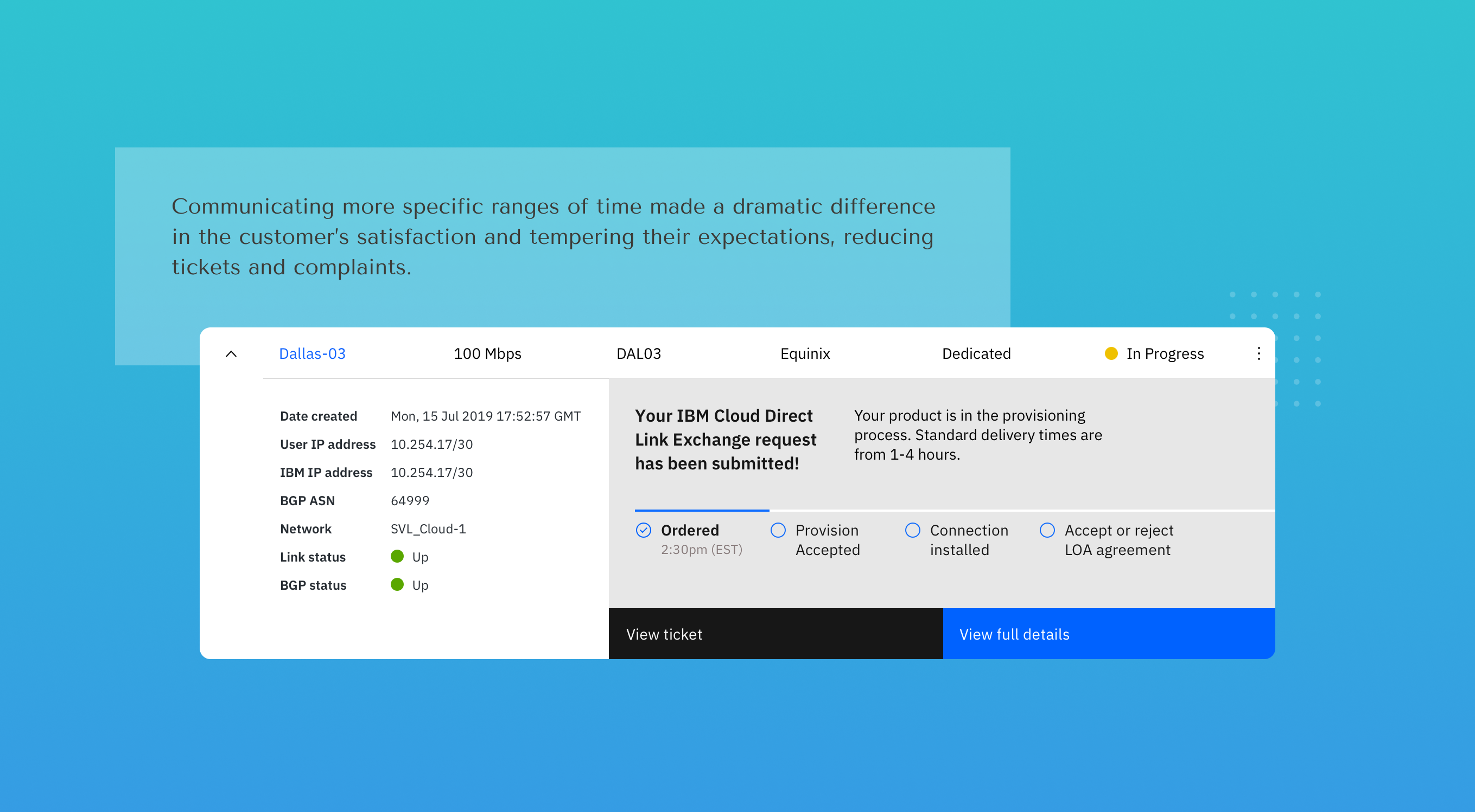
So we asked, how might we assure the user that their actions were accurately and securely captured while also setting the proper expectation for what comes next?


THE SOLUTION
For every action, a reaction
It may sound obvious, but creating an equal reaction to every action that the user takes provides confirmation that they have effectively done what they set out to do and that they should expect the next step. The product lacked this before the redesign, so we made sure that configuring the service and choosing to activate it had clear responses and feedback.
Fake it til you automate it
As mentioned, unfortunately there is a lot about the manual nature of the process that we couldn't change. What we could change, however, was how the process was perceived by the user. We took notions from truly automated digital experiences and provided those cues in our flow - even though it required manual or human triggers.
Surfacing information
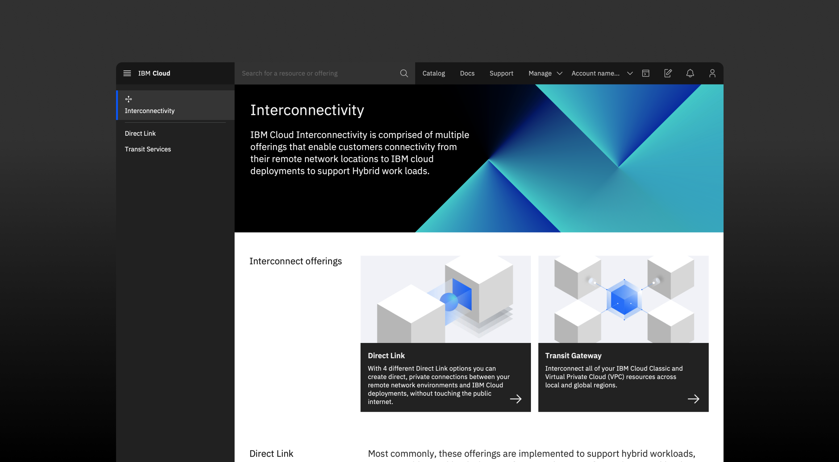
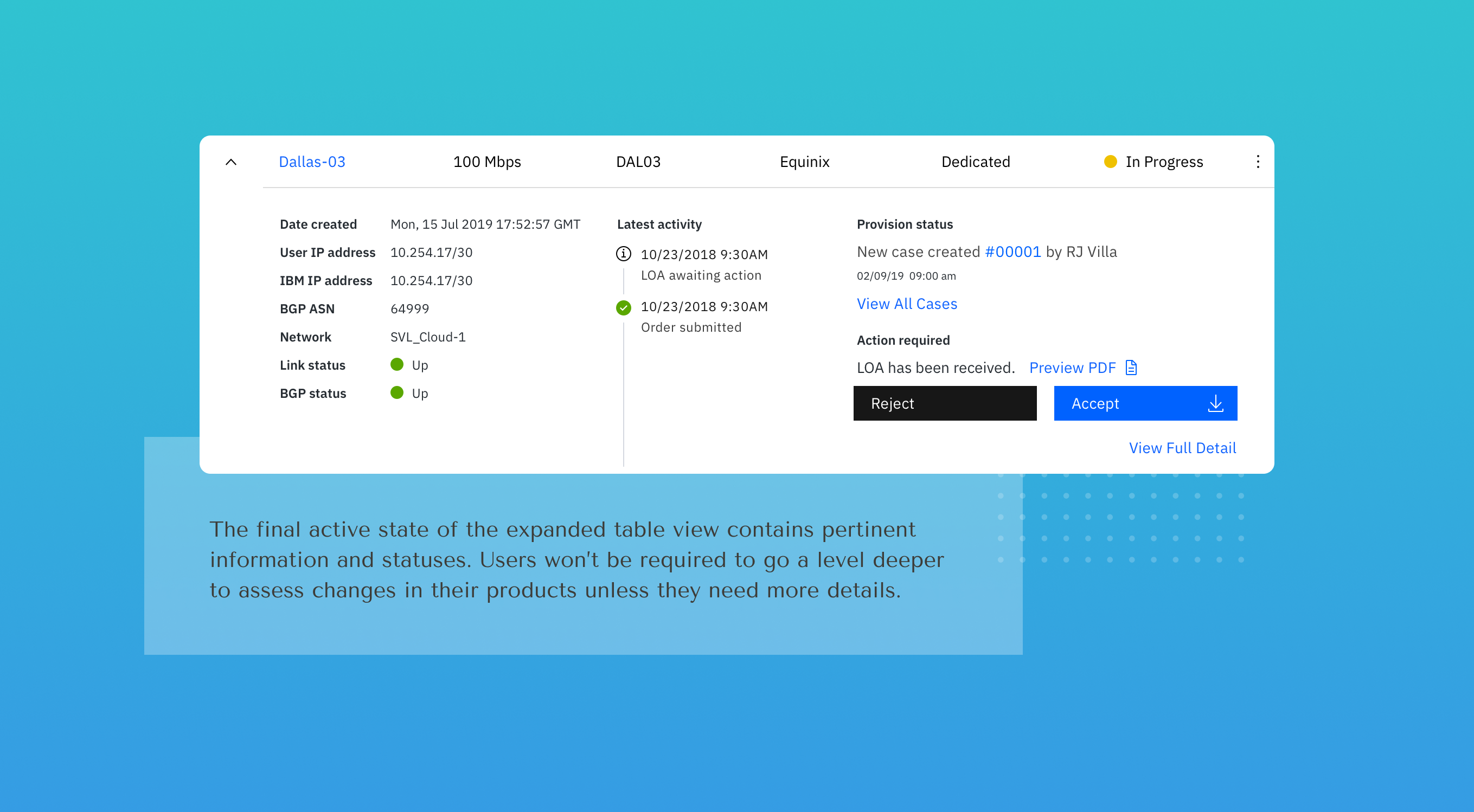
It feels oversimplified to say, if you need to explain something - make it easy to find. Instead of burying information in the docs for users to go on a wild goose chase, we took every opportunity to put front and center the guidance they need when and where they need it. Not rocket science, but definitely had major results.
Selected Works

IBM - InterconnectivityUser Experience, User Interface, Design Lead, Product Strategy
IBM - Project VoltronUser Experience, User Interface, Design Systems

Phlur FragrancesBranding, User Experience, User Interface

LogosBranding

Bespoke Co-OpBranding, User Experience, User Interface

KoffeteriaBranding, User Experience, User Interface
GET AT ME
SOCIAL
myan.aljets@gmail.com





 Pinterest -
 LinkedIn