PHLUR Fragrances
PHLUR strives to reimagine fragrance and disrupt a staid industry that has not changed in decades. The inaugural line of products was created with a unique balance of premium ingredients and environmentally responsible practices. With an immersive digital experience, each scent is explored through visual narratives that represent the inspiration and feeling of the fragrances.
MY ROLE
Design Lead
Brand Strategy
User Experience
User Interface
Packaging
Social Media Strategy

THE CHALLENGE
Until smell-o-vision becomes a reality, selling perfume exclusively online is quite the challenge. We needed not only to build a brand from scratch, but also create an intuitive experience that built trust with customers enough to motivate them to purchase fragrances without smelling them first.
THE APPROACH
We looked at what customers were looking for from a modern perfume brand and how we could fit our product experience into their lives through the channels they were already using; online shopping and social media.

THE USER FLOW
A novel shopping experience
The solution to creating confidence that the user is making a good purchase was the ability to allow users to try the fragrances over a period of time before they commit to purchasing a full sized bottle. Coined the “Warby Parker of fragrances” by the Wall Street Journal, we outlined an experience that allowed users to create a set of 3 samples to test drive and choose to apply that cost to full bottle if they find one they love.

THE EXPERIENCE
First you try, then you buy
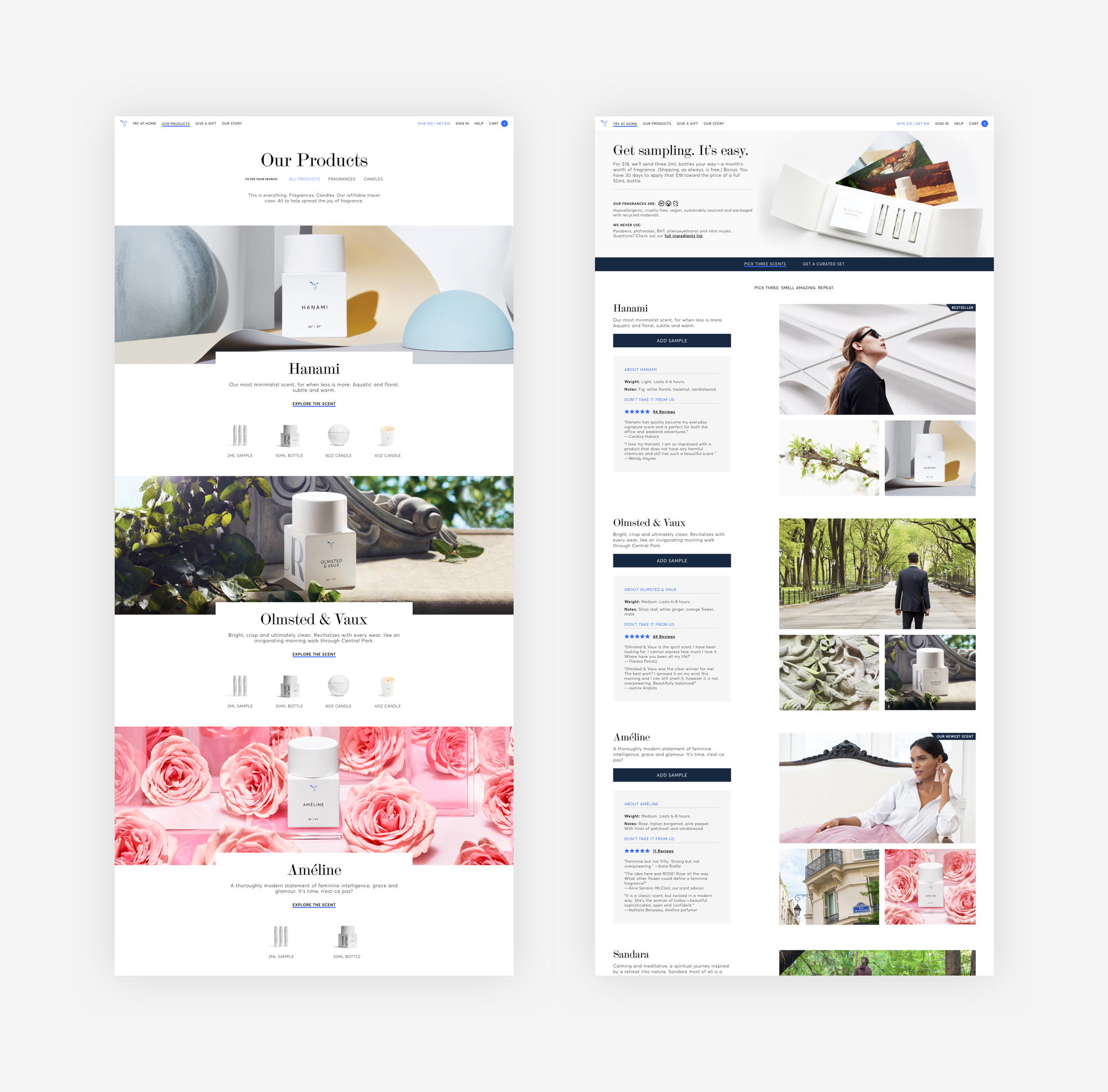
Using imagery, music and practical descriptions, the Try at Home page condensed the information available on the full length product detail pages into more digestible form. Whatever way the fragrance was best depicted to the user was available in view, along with the addition of reviews for each fragrance to fully validate their preferences.
When the user decides to add a sample to their cart, a side panel slides in to allow the user to see clearly how many samples they have left to fulfill their order or to edit easily without losing their spot. Once the sample set is fully formed, the button to add to cart becomes active and signals to the user they can proceed to bringing those babies home.

THE DESIGN SYSTEM
Unified language from URL to IRL
Creating a system that translated between physical product and digital products meant pushing the limits of simplicity while accounting for many different use cases for any given element. The design language between the packaging to collateral to website were carefully considered to maintain a consistent and classic look and feel so that changing elements digitally wouldn’t have drastic implications on the physical, harder to change nature of the real life products. Overall, we stuck to a narrow color palette, balanced typography and clean lines throughout the entire brand suite.

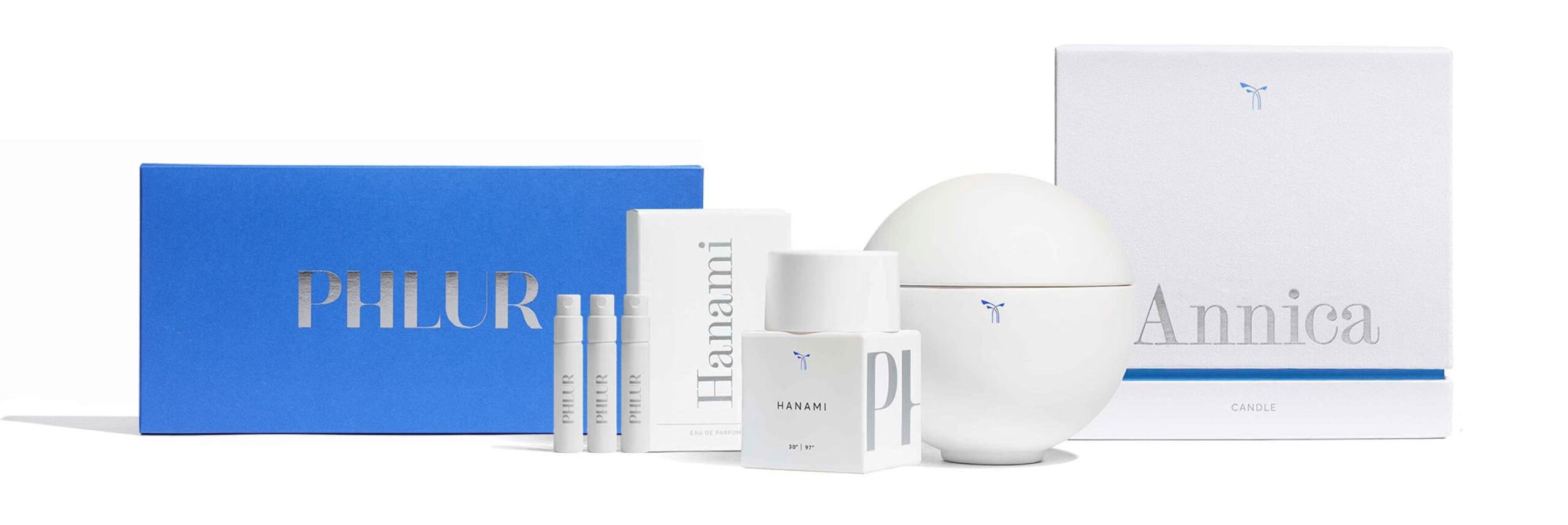
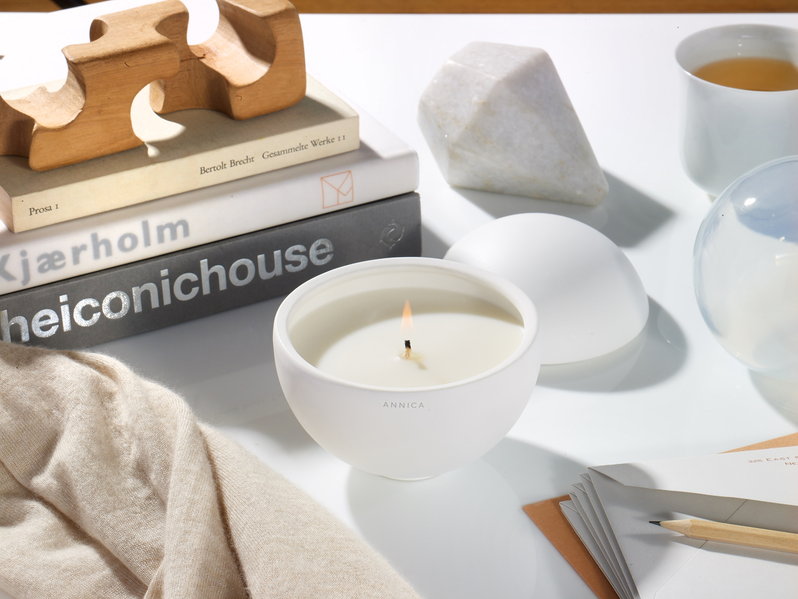
Photography by The Voorhes
Selected Works
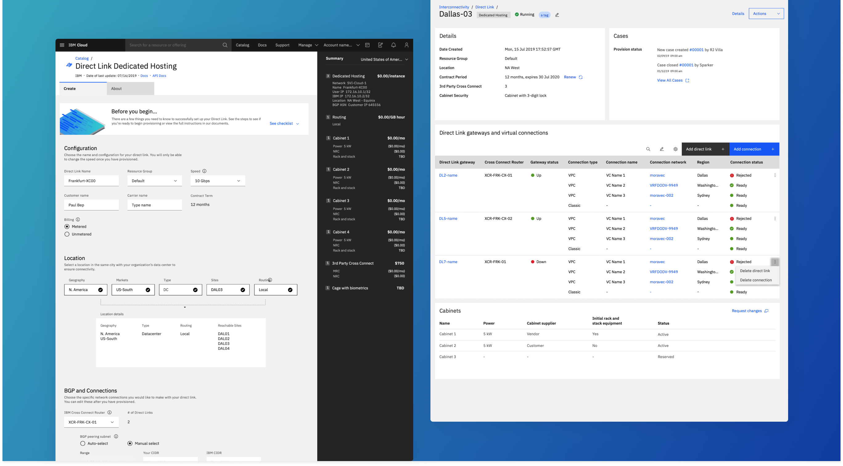
IBM - InterconnectivityUser Experience, User Interface, Design Lead, Product Strategy
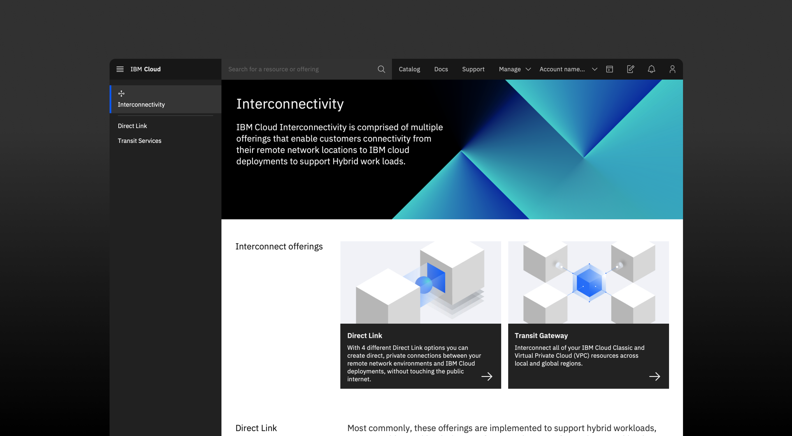
IBM - Project VoltronUser Experience, User Interface, Design Systems
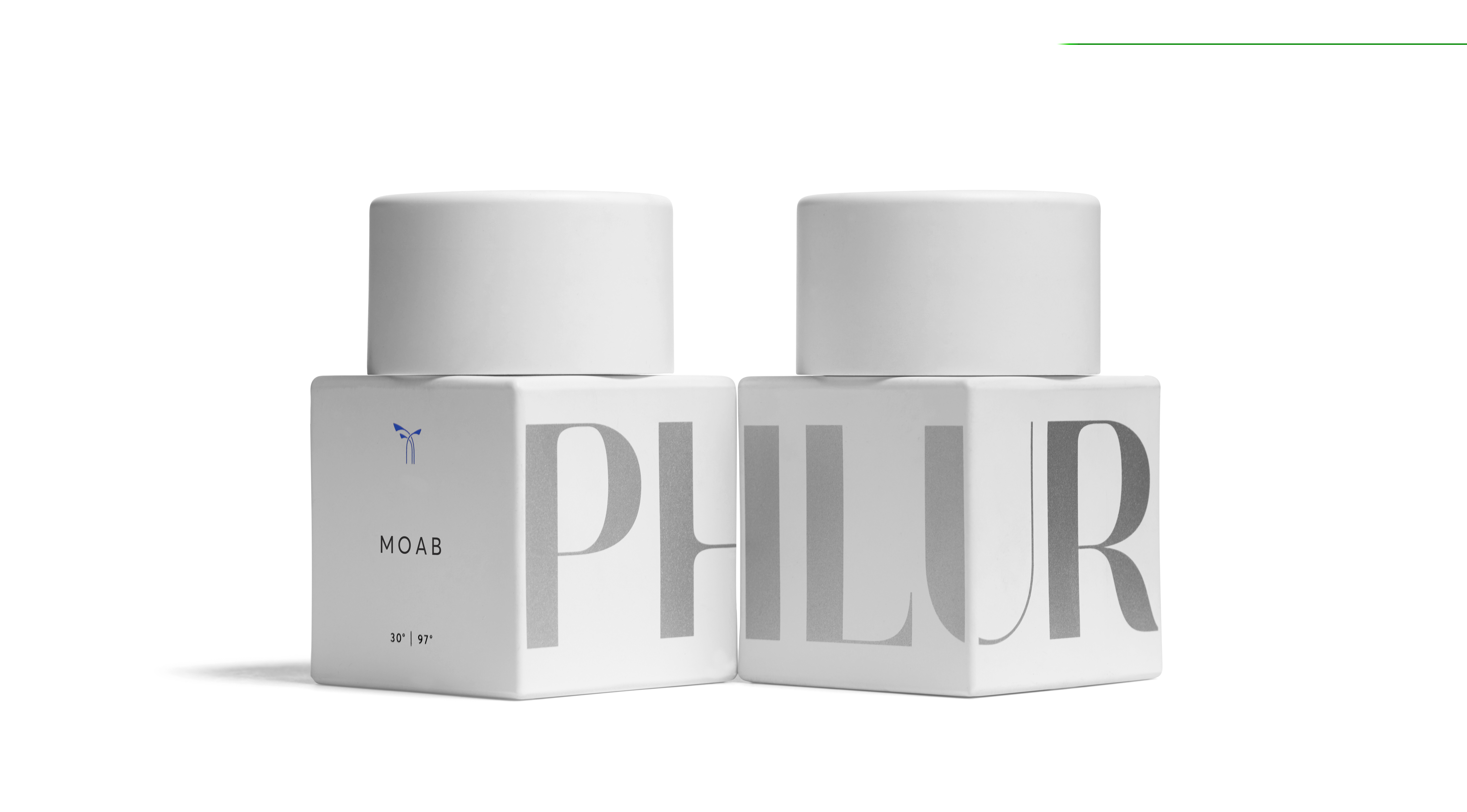
Phlur FragrancesBranding, User Experience, User Interface

LogosBranding

Bespoke Co-OpBranding, User Experience, User Interface
KoffeteriaBranding, User Experience, User Interface
GET AT ME
SOCIAL
myan.aljets@gmail.com


 Pinterest -
 LinkedIn